Bulward is a 30 style (plus variable), all-caps font family inspired by the varsity block archetype and the slightly-worn edges of cast metal type, made fresh via a rough-hewn and quirky construction. Bulward carries an unmistakable aura of tradition and steadfastness, yet there’s a gentleness to its demeanor with subtly rounded counter forms softening its robust appearance and providing a palpable sense of approachability and warmth. Whether set on sports jerseys or packaging for chainsaw blades, Bulward exudes a coarse kind of charm.
Learn more about the design or buy Bulward here.
Partnering with the brilliant folks at Love Street & Co, we created a new logo and visual identity system for Western Union, the world’s leading international money transfer solution.
As financial services go increasingly mobile, the brand needed a concise and impactful identifier that could transcend languages and work hard in both physical and digital spaces.
I developed a new symbol, a W+U monogram rendered in a tension between fluid calligraphic stokes and dynamic multi-directional angles, representing customers and their ambitions in a single mark.
Agency: Love Street & Co
UFC Sans is a custom squared sans serif font family created as part of the UFC brand's exciting new on-air graphic package. UFC Sans has a squared sans serif structure designed to evoke the energy of the sport itself, and its foundational design language is inspired by the UFC monogram logo: slightly asymmetrical rounded corners and counter forms, flat terminals, and blunted tails.
The UFC Sans family consists of a core range of 30 individual fonts featuring a broad range of weights and widths along with a variable font, as well as 6 additional display fonts with more dramatic proportions to convey both the speed and finesse of a flyweight or the strength and power of a heavyweight. The oblique (italic) fonts are set at a unique and aggressive 15.5 degree angle, designed to perfectly mimic the slant of the iconic UFC monogram.
Designed and engineered by me, the font was commissioned and creative directed by Troika Los Angeles as part of their new UFC on-air graphics package, and features details specific to the UFC's unique broadcast needs including logos, tabular figures and athlete ranking glyphs. Representing the brand's global reach, UFC Sans' expansive character set of 450 glyphs provides international support for Latin-based languages in the Americas and Western and Eastern Europe, as well as Cyrillic.
Design & Engineering: Darrin Crescenzi
Troika team: Gil Haslam, Josh Lynne, Ben Nelson
UFC team: Heidi Noland, Hugo Coreas, Bobby Besabe
UFC Sans © Zuffa, LLC. Images used with permission.
Presented the opportunity to unite Reebok under one banner, my challenge was to comb through Reebok’s vast archives to understand which of their many logos had the most equity and potential to unify the previously separated performance and lifestyle divisions, then modernize that asset to meet the needs of today’s communications and the latest methods-of-make.
Resurrecting the Reebok Vector logo satisfies every goal we set out to achieve — it’s beloved, dynamic, and looks amazing on footwear and apparel. To bring the logo forward into 2020, I redrew the Vector and wordmark to improve their reproducibility on product and legibility at smaller sizes, by increasing spacing and refining curves all around. Working closely with their in-house team, I created new identity guidelines for communications and product, and helped the organization execute the new vision across new product, retail, digital and packaging.
Additional design by Reebok’s in-house team.
Creative direction for Aleck, a new 38-font proprietary type family designed to unify the entire AT&T brand across communications, products and experiences. Designed first for performance in mobile environments, the family was gradually expanded to include an expressive slab serif and highly-functional condensed and compressed styles.
Creative direction:
Darrin Crescenzi, Interbrand
Gregg Heard, AT&T
Matt Staab, AT&T
Type design and programming:
Dalton Maag
Video:
Jurgen Koch, Interbrand
Darrin Crescenzi, Interbrand
“Aleck” icon:
Sung Suh, Interbrand
Over the course of 2015, American telecom giant AT&T went through several huge changes: moving into entertainment company the acquisition of DIRECTV, international expansion, and their robust enterprise offering balancing wireless subscriptions in annual revenue. As Interbrand creative director, I led a team tasked with modernizing the visual system, creating a new masterbrand identity as confident in communicating original programming as it was cloud security, united through a refreshed brand blue and reimagining of the iconic AT&T Globe logo.
A two-year undertaking alongside our clients in AT&T Brand Identity & Design, we created a new visual identity, technician uniforms, retail and corporate signage, business collateral, extensive brand guidelines and training program, a 38 font custom typeface, and redesigned the largest corporate fleet in the world.
Done at Interbrand NY.
Creative direction & design: Darrin Crescenzi, Forest Young
Design team: June Kim, Kathy Keen, Sungwoo Suh, Frederico Philips, Claudia Sandoval, Jurgen Koch, Jesse Reagan, Pan Yamboonruang, Kurt Munger, Taylor Simpson.
With his move to the Miami Heat and subsequent uniform number change, LeBron James’ brand mark was no longer viable and required an update. My brief was to begin with the simple, iconic crown from within the existing logo and evolve it to be more memorable and representative of the man. The result blends the crown with LeBron's initials, and subtle visual references to a basketball court in the negative space. The new LeBron logo has served LeBron well now since 2010, being re-interpreted each season across different Nike products. Work done at Nike Brand Design
David Creech, CD
Darrin Crescenzi, design
Created while at Nike Brand Design
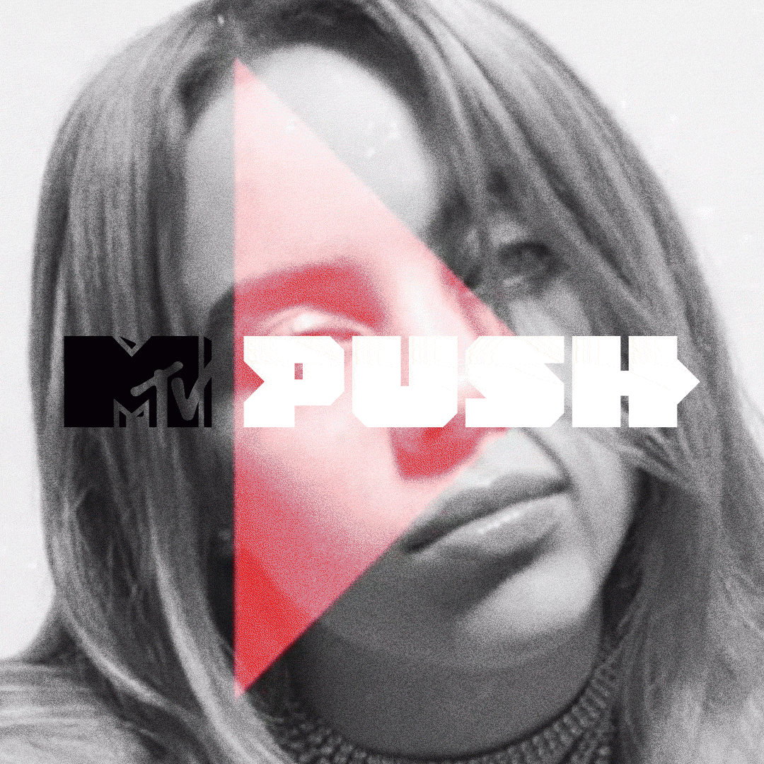
Logo and design system for MTV Push, a bold relaunch of the brand’s iconic ‘Artists to Watch’ program. The concept of the initiative is to take a more active role in promoting talent across the network’s broadcast, digital and social ecosystem. With that mission I created a new logo and visual system based on constantly moving forward-facing arrows, and partnered with MTV’s talented in-house studio to bring it to life via a robust motion package.
Richardson Sales Performance is the global leader in sales training and performance improvement. For over 40 years, Richardson has been equipping sales teams across industries and geographies with the tools and knowledge they need to stay ahead of buyers' changing needs.
After the merger of two companies — Richardson Sales Training and Sales Performance International (SPI) — Crescenzi_Co was approached to create a new logo and visual identity system for the combined company, building from a new brand proposition developed by our friends at Doublebit Narrative.
With the core idea of ‘Growth, simplified’ driving the creative development, we designed a powerful new symbol to bridge the visual equities of the two former companies: the R of Richardson intersected by an upward arrow inspired by the original SPI logo. A bespoke logotype references the round, geometric construction of the new mark.
Beyond the logo, we designed a comprehensive identity program with icon set, whitepapers and publications, presentation templates and flexible guidelines to support both short-term integration of the two companies and long term vision for the combined business' leadership position.
Brand symbols and logotypes designed, directed or collaborated on throughout my career.
I love dystopian fiction, and whether it's unwittingly starting the AI apocalypse, clones for organ harvesting or starting a global war just for funsies, the genre is full of brands behaving badly.
This personal project celebrates my favorite evil companies from science fiction and dystopian cinema, an ode to the logos that make these bad actors feel very, very real.
18" x 24" posters, screen printed in opaque white on 100#C French Construction Blacktop by the nice folks at Half and Half. Hand-numbered edition of 100.
To become the world-class marketing and design company they aspire to be, household electronics company Electrolux needed to modernize their visual identity and retail experience. An updated logotype, influenced by the company's Scandanavian heritage, was created and their iconic symbol was freed from the lockup and used in a more confident fashion.
Their core color blue was darkened to have a more premium appeal, supported by a palette of bold, vivid colors designed to stand out in retail environments. A custom typeface, benefit-driven messaging and imagery focused on delightful outcomes created a new experience on packaging and point-of-sale displays.
Creative directors: Peter Dixon & Hector Pottie
Designed while at Prophet
In 2014–15, the Hornets return when owner Michael Jordan’s Charlotte Bobcats adopt the moniker synonymous with NBA basketball in Charlotte. I was approached by Nike’s Brand Jordan group to develop a new primary logo for the team. Alongside collaborators Rare Design, I created a range of hornet symbols that strived to balance an approachable team look with the fierce aura of the Jordan aesthetic. The resulting primary logo was then refined and translated into a broad range of secondary marks for the wide variety of team applications.
Darrin Crescenzi, design
Rare Design, direction and design
Client: Jordan Brand
Iconic product visuals, packaging and branding created for the unveiling of a revolutionary new product called the Nike+ FuelBand, designed to track everyday physical activity and convert it into a universal metric called NikeFuel. By wearing the product all day long, you get a distilled overview of your level of physical activity, and the ability to challenge yourself to do more through goal setting and social media challenges.
A hugely important moment for the Nike brand, the launch of the FuelBand was a collaboration between the Nike Brand Design, Nike Digital Sport and Nike Brand Innovation teams, as well as several agency partners. The images were leveraged during the product launch event, as lead marketing campaign visuals both in-store and online, on product packaging and as advertising.
Heather Amuny-Dey, Creative director
Darrin Crescenzi, art direction, design
Adam Garcia, design
XYZ Graphics, CGI
Staudinger + Franke, CGI
Created while at Nike Brand Design
Symbol design for NikeFuel, a revolutionary new metric designed to quantify everyday physical activity agnostic of sport, establishing a shareable "currency" via which one can track and compare their activity level with others. Built upon the premise of "if it can be measured, it can be improved," NikeFuel provides a simple overview of your level of physical activity, and the ability to challenge yourself to do more through goal setting and social media challenges.
Heather Amuny-Dey, Creative Director
Darrin Crescenzi, designer
Done while at Nike Brand Design
My interpretation of various House Sigils from George R.R. Martin’s A Song of Ice and Fire series of fantasy novels. Done as a passion project to keep my love affair with the series fresh while waiting for the next novel. One of these currently hangs in the Belfast production office of the HBO adaptation “Game of Thrones," which is very exciting.
18″ × 24″ poster with gold foil stamp, on 80# Mohawk superfine eggshell cover stock.
Printing by Premier Press, Portland, OR
SOLD OUT
On July 16, 2012, Roger Federer surpassed Pete Sampras’ record for most weeks as the top-ranked tennis player in the world. With his 287th week as the world’s No. 1, the Swiss maestro further cemented his status as the greatest of all time.
To commemorate the occasion, I worked with the Nike Tennis team on a limited-edition series of Roger’s signature Zoom Vapor 9 Tour shoe, limited to 287 pairs (one for each week on top of the rankings). I created a custom ambigram logo, pattern and special packaging — inspired by the back of playing cards — to honor the achievement.
Heather Amuny-Dey, CD
Darrin Crescenzi, design
Peet Kegler Studio, additional design
Created while at Nike Brand Design
Branding, uniform and typographic design for Hyper Elite basketball uniforms, worn by Team USA and other Nike Federations in international competition since the 2012 London Olympics. Working with the Creative Director of Nike Basketball apparel, we established a design vision for the uniform wherein a single neutral body color is visible while a player is inactive, with a flash of pop color revealed during a defensive stance, dunk or jump shot — inspired by the defensive behaviors of certain wild fish and birds.
The USA chest badge logo, constructed using the 26 degree chevron from Nike heritage, is meant to be wildly different than anything ever seen on a USA uniform before. Its upward movement references high-flying athleticism, and its composition is meant to evoke the badging of super hero costumes. The uniform is blocked in various 26 degree angles, which also inform the custom typeface, developed in three weights and a full character set for international uniforms
Ryan Aanderud, Creative Director
Heather Amuny-Dey, Creative Director
Darrin Crescenzi, uniform design, typography, branding
Eric Duvauchelle, uniform design
Esther Chang, additional typography
Created while at Nike Brand Design
30-second video piece introducing Nike’s single-thread “Flyknit” footwear technology. Using the metaphor of a robotic hummingbird to communicate the light-weight, breathable construction as well as the sophistication of the manufacturing technique, our little hero knits together a prototype of the Nike Flyknit Racer within an ethereal, zero-gravity environment.
Darrin Crescenzi, art direction and concept
Heather Amuny-Dey, creative director
The Mill UK, character design and animation
Created while at Nike Brand Design
USA Basketball is a nonprofit organization and the national governing body for men’s and women’s basketball in the United States. As the recognized governing body for basketball in the United States by the International Basketball Federation (FIBA) and the United States Olympic Committee (USOC), USA Basketball is responsible for the selection, training and fielding of USA teams that compete in FIBA sponsored international basketball competitions, as well as for some national competitions, and for the development of youth basketball initiatives that address player development, coach education and safety (usabasketball.com).
Known globally for its association with the famed ‘Dream Team’ from the 1992 Barcelona Olympics, the existing logo had great equity which needed to be brought into a new age. The new logo strives to retain all of the iconic elements of the previous mark (split typography, star and ball) but combine them in a more modern, purposeful way, with emphasis on creating a badge that adapted well for use on apparel.
Note that this version of the logo differs slightly from the final version in-use. Designer preference and all.
David Creech, creative direction
Darrin Crescenzi, design
15-second video piece illustrating Nike’s updated “smart” Flywire technology; loose threads on the footwear’s exterior expand and contract based on an athlete’s needs. The narrative of the video illustrates a basketball player in the midst of a dynamic cut, putting great stress on his shoe. The film slows down, and just before shoe gives out, living Flywire grows from within to provide a lock-down fit which enables the athlete to explode out of his plant.
Heather Amuny-Dey, creative director
Darrin Crescenzi, art direction and concept
Royale, animation
Created while at Nike Brand Design
Corresponding with the expansion of the LiveStrong line of products to a global audience, an updated brandmark for the Nike/LiveStrong Foundation partnership was needed to introduce the brand to a new range of customers. Nike worked with the agency Bibliothèque to develop a concept to combine the yellow Livestrong band and Nike brandmark, cementing the bond between the two entities. Logo mark refinement, visual brand standards and product branding guidelines were created by me.
Remco Vloon, Design Director
Eric Duvauchelle, Art Director
Darrin Crescenzi, designer
Created while at Nike Brand Design
The Nike 255 Custom Lab was an experimental apparel customization experience located 255 Elizabeth Street, NYC. VIPs, athletes and influencers are able to create their own Nike Sportswear product with team sport, Nike brand and artist collaboration graphics via a variety of methods, including embroidery, heat transfer and direct-to-garment printing. I was involved with the environmental design and creation of the customization experience, as well as branding, print collateral and establishing the product offering.
Byron Merritt, Creative Director
Michael Shea, Creative Director
Kevin Wolahan, Design Director
Darrin Crescenzi, design
Youngran Ryu, design
Seasonal product graphics by AKA
Done while at Nike Brand Design
Launch campaign for Nike Flywire technology, a new footwear upper technology which utilizes high-strength cables to create a lightweight but incredibly durable fit in athletic footwear. Launched as part of the Nike's Beijing Olympics initiative, the project included branding, product photography, retail displays and more.
Heather Amuny-Dey, Creative Director
Scott Denton-Cardew, Design Director
Darrin Crescenzi, design
Youngran Ryu, design
Created while at Nike Brand Design
Brand voice, identity system and business collateral for Portland-based web design and development firm Periscope Creative. The company’s coastal roots, purposefully small size and personal approach to client interaction informed the design, which is reflects a modern interpretation of colloquial nautical language based on the owner/principal’s coastal roots.
Printing by KeeganMeegan, Portland OR
Product design, branding, packaging and product photography art direction for the launch of (Nike)RED laces product, part of the broader “LACE UP. SAVE LIVES.” initiative, Nike’s contribution to the ubiquitous HIV/AIDS awareness campaign.
I worked on the lace product design, dubré, lace and ball packaging, POP displays, branding, product visuals, and art directed the PR photography.
David Creech, creative director
Paul Reidmiller, photography
Done while at Nike Brand Design
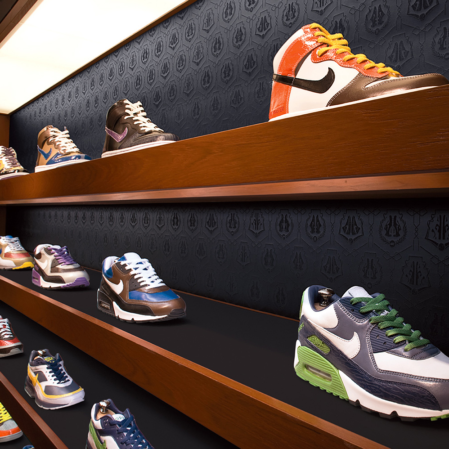
Appointment-only footwear customization space located on the 6th floor of the Niketown New York flagship. This experience was the model for the entire NIKEiD Studio program, allowing consumers to customize footwear with exclusive colors and materials, led by a Nike Design consultant. I worked on experience design, branding, custom fixtures, retail graphics, patterns and print collateral.
Heather Amuny-Dey, CD
Scott Denton-Cardew, DD
Darrin Crescenzi, designer
Cynthia Tuan, designer
Brendan Finlayson, designer
Hybrid Design, additional design
Created while at Nike Brand Design